How to Colour Coordinate Your Interiors
We have all been there. You finally decide to take the plunge and redecorate. You begin with one colour for the walls, then another for the carpet, then another for the furniture, more for the accessories and so on, until, before you know it (or can help it!), it looks like a rainbow has exploded in your lounge.
When designing your room – from layout of furniture to accessorising – coordination is key. This applies for your colour choices too. Getting the colours you’d love in your rooms to work together harmoniously is something you want to do right first time. It’s one of those situations where it is easier to add to, rather than take away – like a haircut!
Here are some methods you can use to ensure perfect colour coordination in your abode.
Majority Rules
If you are simply re-decorating, rather than starting from scratch, have a look at the most dominant colour at the moment, that won’t be changing. For example, walls and floors take up a substantial amount of space. If you are not planning to change the wall paper, or lay down new carpet, try and work out the dominant colours in these spaces, and use these for direction.
A great tip is to promote these large areas of space by reducing the amount of accessorises in the space. Open the layout of the room through reducing the clutter, and only having as much furniture as necessary. This will then ensure the dominant colour of the walls and floor shine through, allowing for easy coordination with the fun stuff like vases, curtains and cushions.
Techno-whizz
Isn’t technology a wonderful thing? Smartphones, self-driving cars, passenger flights into space… what’s next! Well, technology hasn’t skipped on the DIY interior designing world either.
Have a colour scheme in mind for your lounge make over but have the inevitable fear that it just won’t work? Don’t worry, it happens to the best of us. However, technology has come to the rescue! Now, you can go on the internet and create virtual rooms – similar to yours – and drop colours into the image to see if it all coordinates! No more risking it and hoping it all “works out for the best.”
This could possibly be one of the most effective ways to ensure your budding interior design vision doesn’t fall flat, or look like a 5-year-old’s kindergarten finger painting.
Utilise your Scrapbooking Skills
Want to test your colour preferences but need something real and solid to look at, rather than a computer screen? Summon those High school scrapbooking skills and create a mood board. This is a great way to really test whether – what you believe is divine creativity – will actually work.
Professional interior designers create mood boards when planning new looks, so you, the flourishing DIY interior designer can too. By combining your visualised paint colour, samples of wallpapers, fabrics and flooring, and pictures of furniture and accessories, you will have a detailed overview of your fantasy room in one place, ensuring all your favourites work together in perfect harmony.
Thinking Big?
Hey, why you’re at it, why not colour coordinate your whole house? Considering all the rooms in your abode together can create fabulous results, and could even save you money.
By continuing the colour schemes from one room to the other, it gives each room a sense of familiarity and creates a sense of ‘ease’ that is hard to achieve if every room has a different theme. Repeating colours will also make your decorating budget go further – buy in bulk!
This doesn’t mean that every room has the same shade on walls, ceilings, floors, furniture and accessories, (can you imagine what that would look like?), just that the dominant colours are repeated, somewhere within room, from one space to another.
Simple Steps for a Fabulous Effect
Colour coordination within your abode isn’t actually that hard to do, and is well worthwhile for the harmonious atmosphere it will bring to your home. Whether your taste is for the bold, subtle, or anywhere in between, colour coordination will return visual results that well outweigh the effort needed to achieve it.
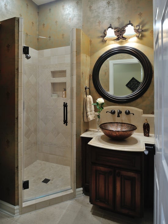
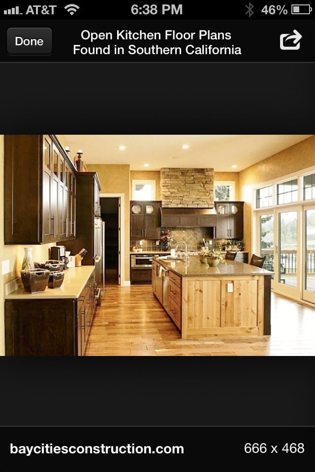
Featured images:
 License: Image author owned
Laura writes for Jaga Home Heating. When not writing, she can often be found coloring . . . outside the lines.