The colors you choose for your house exterior deserve some serious consideration. An impulsive choice that you’ll regret stays with you for years to come and its inescapable presence serves as a reminder of your hideous mistake.
If you live in a subdivision with homeowners association policies in place, the range of selection for exterior house paint may be limited. But that shouldn’t hinder you from having beautiful outside walls and roof complete with color match roof coating that you want to come home to everyday.
Colors affect us subconsciously. In the color spectrum, there are warm and cool colors. Warm colors are the colors of fire (reds, oranges and yellows.) They excite and stimulate the viewer, give prominence to the object and make a room feel smaller. Cool colors are the hues of nature and the sea. They are the blues, greens and purples and have a calm and relaxing effect on the viewer.
In the United States, the southern regions evoke a warm and rustic atmosphere, and houses are painted to complement the ambiance. Earth colors like beige, sand, latte, cream to dark reds and dark browns are popular. The cool temperatures and icy ponds of the northern states inspire whites and all shades of blues and grays for house exterior colors.
Here are tips for choosing colors that can help you out:
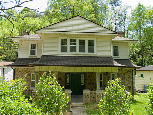
Use three different paint colors. The basic house exterior scheme is composed of three major colors: field color which is the main hue, accent color for doors and shutters, and trim color for door and window frames and roof edges. The trim color is usually a strong contrast to the field color, and accent colors are bold but in limited amounts. If you’re planning to replace your roof, you should hire professional roofing contractors to help you install a residential roof replacement that will match your home’s design and color theme. And even if your roof does not need replacement.
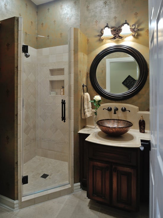
The house interior colors may give you ideas for the exterior colors. For images of house interiors and rooms, click here.
Establish a balance. Don’t let one color dominate everything else. Too much of accent color is loud while having all light shades is blah. Don’t use too many colors; it will make your house seem complicated. And take a hint from your surroundings and the neighboring houses by choosing colors that complement them.
To help you choose a color combination, have a color wheel on hand and know the most used color harmonies:
Analogous – colors are next to each other on the color wheel. Analogous harmony gives a congruent and comfortable design that is easy on the eyes.
Complementary – two colors that are opposite on the color wheel. A third color may be added according to your choice. The two opposite colors provide contrast and give off a vibrant vibe but it must be well-managed so as not to be grating to the senses.
Triad – one chosen color and the two colors on either side make up a triad. To make a triad harmony work well, one color should be dominant and the other two are used for accent.
Split-complementary – a modified version of the complementary, it has a base color and the two colors that are on either side of the opposite color. The opposite color is not used. The contrast is not as noticeable as the complementary harmony.
Rectangle or tetradic – two complementary colors are picked out and the two colors on either side of the two main colors are used. There are four colors in all and the possibilities for variations are numerous.
Square – four colors are chosen from the color wheel. The two colors opposite each other and another two opposite colors to make up a square.
Citations:
Featured images:
 License: Creative Commons image source
Marie Miller dabbles in house interior designing and decorating. She helps out friends building new homes or renovating existing ones with her design concepts.

