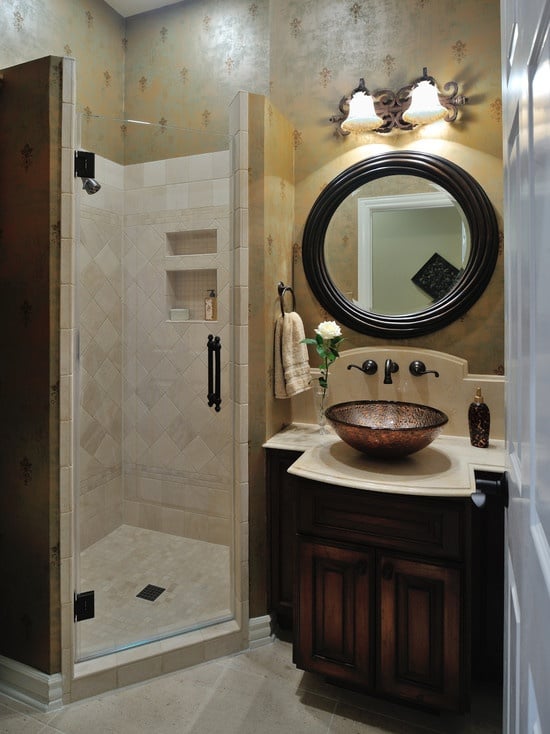
In home decoration, one of the easiest ways to have a room jump out to the senses is a fresh splash of color. Painting a room brown, however, may not be the best way to make something stand out, unless that something is the essence of brown, in which case go for it!
![]() Not to poke fun at any colors in particular, but typically only choosing the right colors for a project can make that project stand out and shout how you want it to. Color schemes and combinations, following the principles of color theory, are techniques used to pair certain colors with each other to achieve different means of harmony and aesthetic pleasantry.
Not to poke fun at any colors in particular, but typically only choosing the right colors for a project can make that project stand out and shout how you want it to. Color schemes and combinations, following the principles of color theory, are techniques used to pair certain colors with each other to achieve different means of harmony and aesthetic pleasantry.
Color theory is the guiding principle behind color mixing and the effects of a certain color combination. Color combinations can fall into a few separate categories based on how the colors are used against each other. In a monochromatic color scheme, the colors are all tints, tones, and shades of a single hue. For example, it’s all red, but in different shades and intensities. These different shades often complement each other.
For truly breathtaking combinations, though, complimentary colors are often used. Complementary colors are pairs of colors, which, when combined in the right proportions, produce white or black. On traditional color wheels, these colors sit on the opposite sides of each other in the circle.
Placing complimentary colors next to each other creates contrast and, therefore, reinforces each other and strengthens their brightness.
All this talk about color probably leaves you wondering where we’re trying to go here. Color combinations are like fashion. The hot ones this year are probably not so hot next year. They go in and out like trends or phases.
 In 2013 in both graphic and interior design, the hottest color schemes were bright and bold colors in combinations that contrasted heavily, drawing the eyes to their features. 2013 was the year of “flat design,” which is most evident in phone operating systems (I’m looking at you, iOS 7…)
2014, on the other hand, is looking more and more to be a year of light, springy, pastel like colors that will compliment the utilitarianism of flat design very well. The color palette of 2014 will be one of more natural, muted colors that can all achieve harmony in unison, rather than a select few colors that only work with their lighter shaded or opposite counterparts.
One example is pastel pink and silver. Used heavily in fashion (think light jeans and a pink top,) this color combination is very versatile and can really be used anywhere you may need a light but interesting combination.
Home paint company Benjamin Moore embraces these trends, and as a company, is focusing on catering to them. They’ve acknowledged the move towards a more pastel palette without looking “too Eastery” and offer a 2014 catalogue that caters to this. 2014 is categorized as moving more and more away from grays and whites to blues and pinks, without the flashiness of full colors.
So, armed with the knowledge of what’s hot and what’s not this year, what should you do?
The idea here certainly is not to paint your walls every year to follow the incoming and outgoing trends. That would just be an enormous waste of time, effort, and money. Painting once is hard enough, imagine doing it every year!

What these trends mean is a little more than that. They act a little more as guidelines. If you’re currently in the process of trying to change something about a room in your home, color trends can act as guidance of which direction to go in to have that room still look stylish down the road.
Even though the trends of 2014 have replaced those of 2013 doesn’t mean that the previous ones have been rendered completely obsolete. Quite the contrary, actually.
Trends, although short lived, hold their appeal for years because everyday people aren’t color, interior design, or fashion critics. They’ll look at it and think, “I think that is currently or has at one point been in. This person seems trendy!”
It’s a win-win. So, moral of the story is, The trend is changing, but you don’t have to. Bright, flat design is on its way out and light pastels are on their way in. Don’t stress yourself out on following the latest trends, though.
This article was written by Eric Kneff in association with Brahman Systems, a producer of an industrial cable protector. He has an interest in color theory and its application in design.